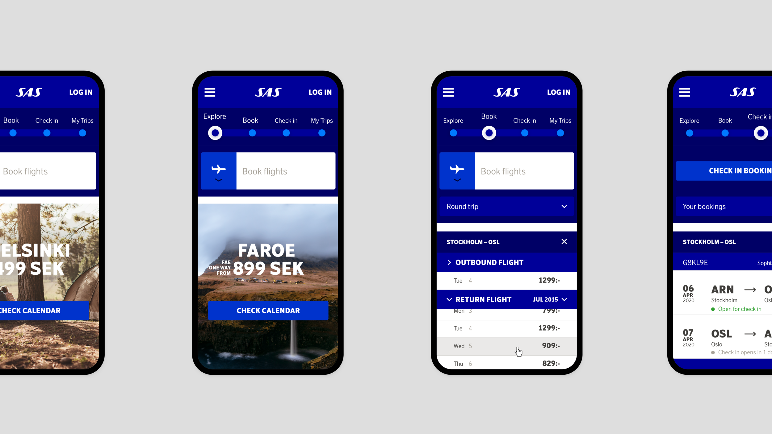
SAS UX/UI
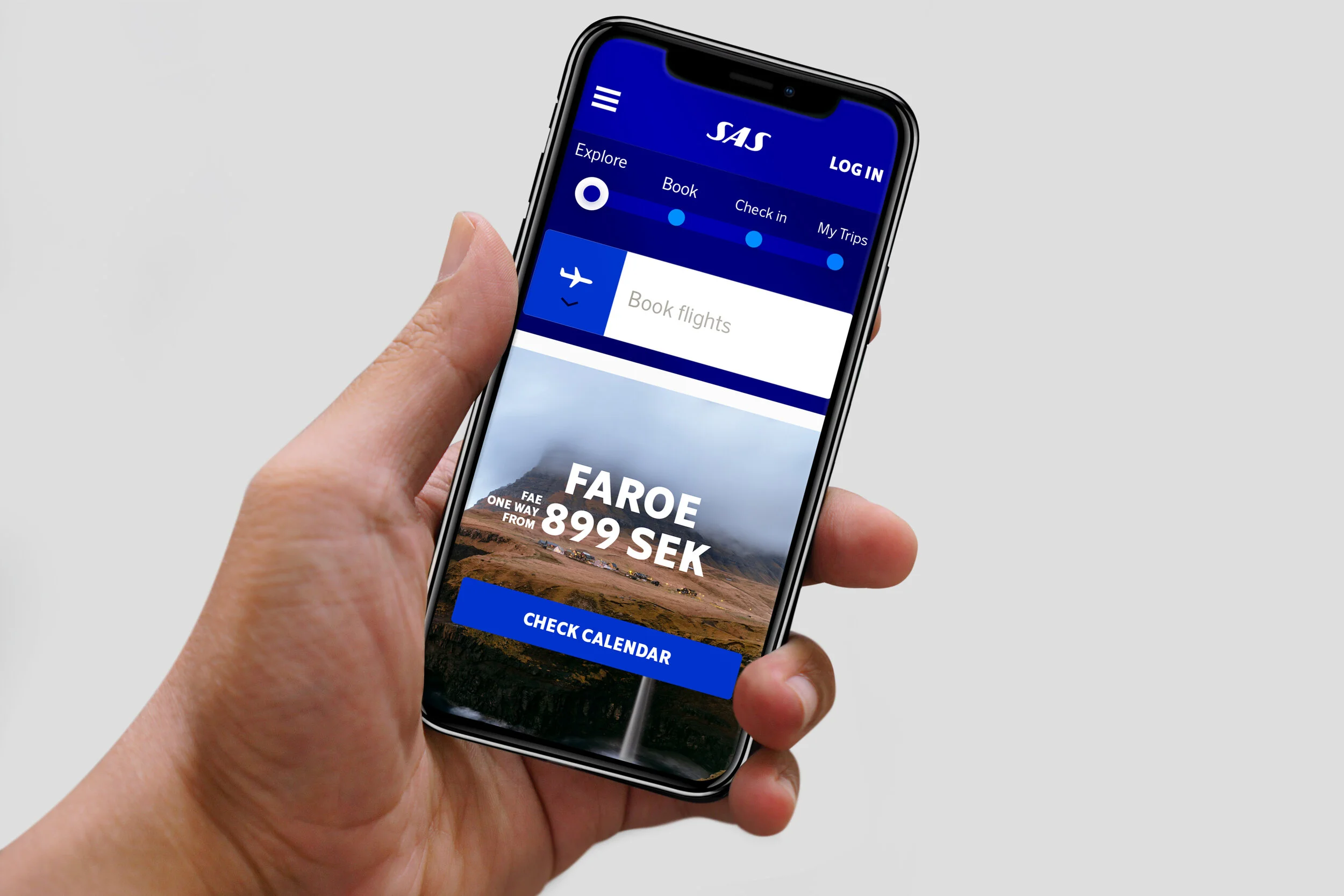
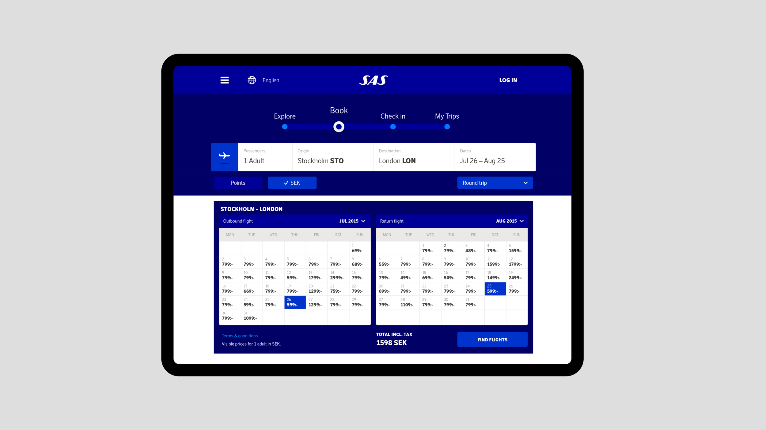
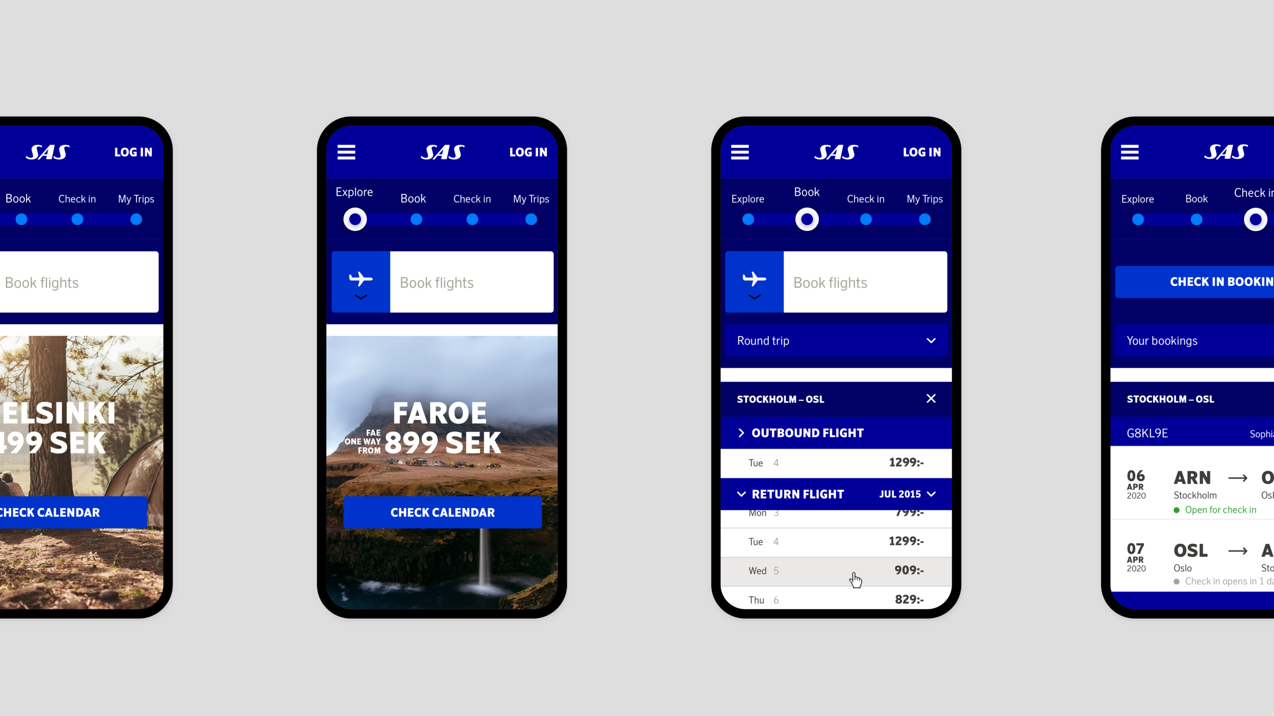
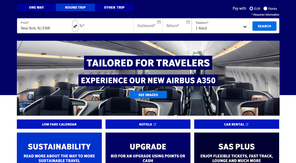
We made small changes of the color palette to provide a consistent, positive experience for all users to require W3C and the WCAG 2.1 standard. That allows SAS to work towards taking ownership of the color blue through working with a blue-on-blue color concept. The text boxes are used to a lesser extent to contribute to a more simple navigation and instead uses carefully selected background images that provide good contrast for text.
Design at Bold Scandinavia